How effective is the combination of your main product and ancillary texts?
To answer this question we will be explaining how our trailer, magazine and poster together form our brand image. Branding is extremely important as it means that certain images can be easily recognized with your trailer and movie. Branding can help you stand out from the other films that you are in competition with and help build an identity for your film to engage your audience and by doing so, making the film more memorable. This is why branding is so important. If you can link one single image to your film it means that every time the audience see that image they will remember your film, making it well known and potentially more popular.
When it comes to horror there are many images, fonts and characters used in their trailer, posters and magazines that make you automatically recognize what film they are from.
When it comes to horror there are many images, fonts and characters used in their trailer, posters and magazines that make you automatically recognize what film they are from.
|
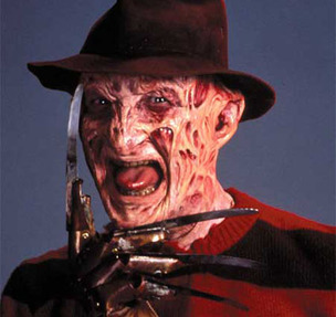
Freddy Krueger is an iconic character from the film 'Nightmare on Elm Street.' This film has become easily recognizable not only because of this character but because of the props used, such as the knife fingers and the hat. This film first came out in 1984 and is still well known and popular to this day showing how effective their branding image is.
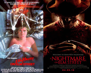
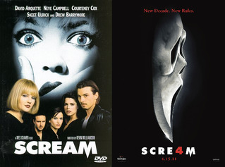
This film was such a success that in 2010 they decided to remake the film. As you can see the poster from the 1984 version is very different from the 2010 version. In the more modern poster it is solely based on the villain, Freddy Krueger, whereas in the first film it highlights the victim more than the villain. This suggests that since the first film was released the villain has become so well known that they only needed to feature him on the poster, as the audience will immediately know who he is and that the film is 'Nightmare on Elm Street.' Another example of this would be the film 'Scream.' The poster of the first film which was released in 1996 only shows the characters/victims and doesn't even include the iconic scream mask. However in the later poster of Scream 4 which was released in 2011, it only shows the scream mask and doesn't include any of the cast. This show that the mask has become the branding image for the 'Scream' films and that when we see that mask we will associate it with the 'Scream' films. |
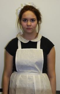
Every popular, well known horror film has something memorable about it that they reuse in every poster. Here are some examples of memorable shots, characters and posters. As for our poster it is Megan, on the poster it is her in the maid outfit as this is the most memorable thing in the film.
Font is also used to as a memorable branding technique. However we believed the Victorian maid was a more memorable brand image, which is why we chose a simpler font.
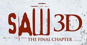
'Saw' is a classic example of a horror film which uses the same font throughout all the films. Even though human body parts are probably more well known as Saws branding image, this font is still well known and can be considered part of the films branding image.
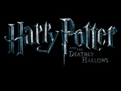
The film 'Harry Potter' is a film made in Britain and is a massively popular and a well known film all over the world. This Font is the main branding image of 'Harry Potter' and can be seen throughout all the films. Another reason this font is part of the branding image is because the P in the 'Harry Potter' title is the shape as the scar that can be seen on the main characters head, which is why we automatically know the film and whats its about.
Jigsaw Planet:
This is our Jigsaw, the first one is our magazine and the second our poster. This is very important for our film branding as the maid is our branding because the maid is the main character and is our icon, but it also has the smashed glass which represents the photo frame from our trailer. As for the magazine it also has the main branding as Megan is the main character.
Props:
The photo frame is iconic in our film, as this is when the paranormal occurrences started to happen and it is featured at the beginning of the trailer. We took the idea of the photo frame in the trailer and included this in our poster. We decided to use smashed glass in our poster as we wanted to include both of Megan's identities, her as the Victorian maid and her as her normal self. The smashed glass effect can also be seen in the 'Final Destination' poster, which we used for inspiration. The photo frame that we used in the trailer was the inspiration for our title 'Capture'. The most important and memorable prop we used in the trailer was the maids outfit, as the maid was considered the villain in the trailer and the most memorable character.
Main Icons:
Throughout the whole process of planning, making and evaluating our trailer our main icon is the maid, she is seen throughout the trailer as well as our poster. We did this to help create brand identity.
|
This is the photo of the maid, she appears a numerous amount of times throughout our trailer.
|
In our magazine you can also see the maid, in this we also showed Meg as the younger victim in order to show the contrast. We decided to put the maid here as well to help with the brand identity and so people could start to piece our trailer and poster together.
In the magazine we decided to do something different and have the victim instead of the killer even though they are played by the same person. This was because we thought it would be more effective to have the victim looking glamorous on our magazine to attract people to want to watch it.
In the magazine we decided to do something different and have the victim instead of the killer even though they are played by the same person. This was because we thought it would be more effective to have the victim looking glamorous on our magazine to attract people to want to watch it.
In our trailer, magazine and poster we tried to keep to the same font in order to show that all three products relate to each other. We kept the text white so it would show up and look effective on the dark backgrounds or the blood stain.
Analysis
TITLE
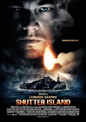
As commonly seen in a variety of posters the title of the film remains at the bottom of the poster, this draws the viewer's attention to the character and island above. The title is an orange colour which matches the colour of the flame seen in the poster, this is the only colour seen on this poster indicating to the audience that this is a dark and mysterious film. The fact that the majority of the poster is taken up by the main character who is played by the actor Leonardo Dicaprio and the fact that his name is placed just above the title indicates that he is a big selling factor of this film as he is a famous actor with a huge fan base.
SLOGAN
The slogan used is shot and to the point. 'Someone is Missing' immediately indicates to the audience what this film is about but also leaves the audience with a sense of mystery, which draws them into watching the film.
PHOTOGRAPH
As previously mentioned Leonardo Dicaprio is a main selling point when advertising the film, which is why his face takes up the majority of the poster. By him holding a match it gives a lighting effect where his face appears half in the light and half in the dark. This foreshadows events in the film as we discover his character believes he is a detective searching for this missing patient, when infact he is being kept in the dark by the doctors and even his co workers. The genre of this poster becomes clear by the picture of the island. We can see that this island is distorted and surrounded by this stormy weather which indicates that this film will be horror related.
Font:
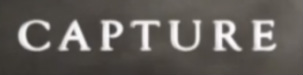
All three of our titles are similar, they all have a glow on them and are bold. There are slight differences in the text but this is mainly because they were all made on different programmes where you can only find similar texts. We made all the texts similar in order to help with brand identity and to help our audiences link the three products together. We made the title on the magazine a different colour we did this because, we thought that the red and the yellow went better, it also made the capture stand out more and made it fit with our magazine.
