(T.S/L.M)
Shrooms-2007
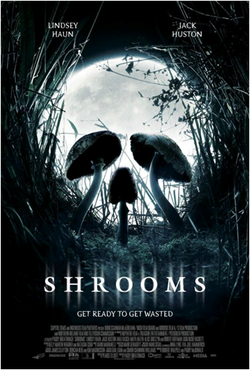
We find this horror poster particularly effective because, the mushrooms with the moon in the background make it look like a skull. When you first glance at it, you just see the mushrooms, linking with the word shrooms, and the moon. Then when you look at it fully you pick out that together they make something different. I think this is effective because it makes the audience look at the poster in more detail. The colours relate the film to night; in horror night is usually related. This is because they believe everything becomes scarier at night. The way everything is dark whereas the writing is white, makes the writing stand out more, when we first look at the poster the first thing I notice is the writing, this makes it effective because it means everyone will clearly know what film it is.
The Final Destination-2009
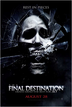
We find this horror poster effective because of many different things. The picture in the middle is a disorientated skull, with shattering glass around it. This links in well with the tag line ‘rest in pieces’ because there are pieces of glass around the skull. Because the colours are dark the white skull stands out more. The dark black eyes make the skull look scarier. The title ‘the final destination’ is effective because the ‘the’ is small whereas ‘final destination’ is big. This makes the main part of the title stand out meaning that people will know exactly the title of the film.
I Saw The Devil-2010
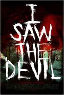
We found this horror poster effective because, the faces in the background have an effect of blood over them, which suggest that it will be a thriller. The faces are difficult to see as the writing is over them. This makes it more effective as it could be said that these people are hidden. The writing ‘I saw the devil’ is effective because the white stands out over the poster. The fact that it goes across the whole photo means that it is eye catching and easy to read. The title also makes a clear statement about the film.
The Last Exorcism-2010
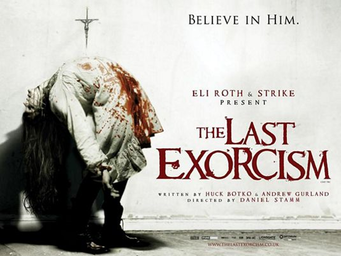
The image used of the girl used on this poster
immediately highlights the sub genre of the movie which is paranormal. The mutated paranormal is
what people are afraid of. Another good effect used is that by only using the colour red it makes the blood and text more noticeable and suggests danger and gore. The white background and white dress used here is a connotation for innocence and purity which contrasts with the genre and image shown. The text they decided to use ‘Believe in him’ automatically creates fear as it’s a warning.
Drag Me To Hell-2009
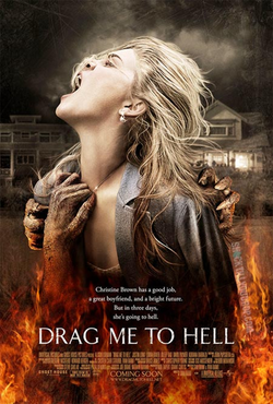
The background reveals the location of the movie, which appears to be a normal neighbourhood. This follows media horror theorist Clover who believed that bad things are more scary if they happen in a place we feel safe in. The Victim shown here is a young blonde girl which again is another Carol Clover theory. The more vibrant colours in the fire suggest that the evil is more powerful than the drained-low contrast real world, red also has connotations of danger.
Mirrors-2008
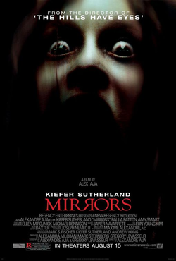
The use of low key lighting only reveals half of the characters face, this gives the viewer an impression of mystery and secrecy as all of the characters emotions are shown through the eyes which in this case looked scared. The exaggerated pupils in the eyes show fear and vulnerability of the character. The title is red, a colour usually associated with danger it also stands out as red is the only colour used. In the title one of the R's are reversed as it would be a mirror.
The Uninvited-2008
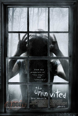
From the background in the poster it
shows the Wes Craven theory, that bad things happen in bad places. By showing someone looking through the window it creates the feeling that they are watching you which creates a sense of mystery, this is also done by not being able to see her face trought the window due to lack of visibility. This is also shown by the white eerie font.The lack of colour in this poster suggests a dark theme.
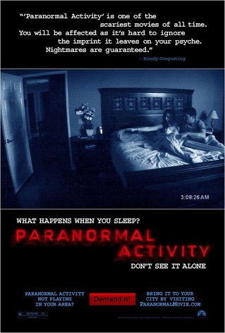
Our poster:
|
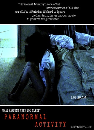
|
For a part of our bridging task we had to create a poster
for our trailer, we decided that we would pay homage to the paranormal poster
as it was the trailer we had to recreate the ‘paranormal activity’ trailer. We
found this poster effective as it doesn’t give too much away about the film yet
it is detailed enough to tell the audience what it is about, the red title is
also effective as it is the only colour used in the poster, the colour red also
as connotations of blood and danger so it fits with the paranormal genre. The quotes
used at the top of the poster are from viewers of the film who described it as ‘the
scariest movie of all time’ which is brilliant for horror fans and exactly what
they want to hear. The caption ‘what happens when you sleep?’ is effective as it’s a rhetorical question making the audience question what happens in the film, the picture used is also effective as it looks like its filmed with a home camera as it has the time at the bottom right hand corner and looks as if it’s a still taken from the film itself.
