In what ways does your media product use, develop or challenge forms and conventions of real media products?
Using Conventions:
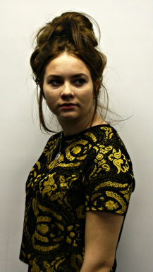
1) Its commonly seen in horror films such as 'The Woman in Black' (2012) and 'The Ring' (2002) to use a girl as the main source of the audiences fear, this is what we decided to do in our trailer. Megan plays a Victorian Ghost who haunts her existing family members out of revenge.
2) Our trailer features a' final scare' which is extremely common and will be seen in almost every horror trailer. This is done to leave a lasting impression on the viewers to remind them that this is a film they want to see.
3) All the victims and the majority of cast members that are featured in our trailer are teenage girls. This is because the main audience of horror films are teenage boys and young male adults, this means that our trailer appeals to its target audience.
4) Our trailer contains quick paced shots that build up towards the end of the trailer. This is commonly used in many horror trailers as it allows you to use a variety of shots that reveal some of the narrative to the viewers but do not give away the plot. It also builds suspense as the soundtrack quickens just before the 'final scare.'
5) Our trailer location is in an old family house. This is often seen in horror trailers, for example ‘The Conjuring.’ (2013) The theory from West Craven argues that it is scarier to be murdered or haunted in your own home as there is a false illusion of safety. This theory is also expressed by Carol Clover who states that ‘walls that seem safe and keep the killer out soon become a prison keeping you trapped with the killer.’
6) Our trailer also features an absence of parents. This is commonly seen in horror films and trailers, an example of this would be ‘Scream.’ (1996)
Challenging Conventions:
1) Our trailer challenges conventions as the victim of our trailer is being haunted by her Victorian self. This means that they look identical. This is not commonly done in horror however a similar idea can be seen in the film ‘The Black Swan’ (2010)
|
|
2) Instead of having dialogue from a character featured in our trailer we decided to create a rhyme. This is unusual as normally trailers contain at least on piece of dialogue from a character, whereas our trailer does not include any.
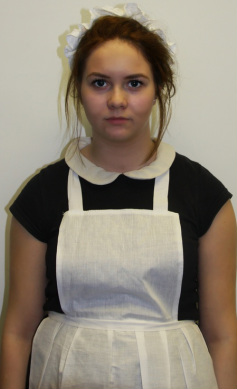
3) Even though we did feature teenage girls in our trailer we did not use the stereotypical blonde that is often seen in horror films.
4) In paranormal films it is not common to have an excessive amount of blood featured in the trailer however we decided we wanted to feature a blood scene to attract a bigger range of audience.
Poster:
We broke conventions by having our killer fully on the poster so people knew what she looked like without watching the film, this is because we felt like it engaged people into our film more as they would want to know why there was a Victorian Maid in our film. We used conventions in our poster by having a dark background which is common in horror posters.
Magazine:
We broke conventions in our magazine by having a white background in contrast with the smeared red stain to look like blood, we thought white was the best colour for the background as it could clearly show the contrast with the red blood and the glamorous cast member in the middle.
Our inspirations:
We took inspiration from the 'Final Destination 5' (2011) poster and the 'I Saw The Devil' (2010) poster, this is because the final destination poster has smashed glass of a skull, we took the idea of this and created the smashed glass of the victim in contrast with the killer in our poster.
We took inspiration from I saw the devil in our magazine as they use a white on red contrast with the top of the faces looking like they are covered in blood and the bottom being pale white. We have done this on our magazine but used it as our background with the glamour girl in the middle.
We took inspiration from I saw the devil in our magazine as they use a white on red contrast with the top of the faces looking like they are covered in blood and the bottom being pale white. We have done this on our magazine but used it as our background with the glamour girl in the middle.
